Lighthouse: A Casual-Elegant Handwritten Font for Digital Branding
It started with a hero section—just a soft gradient background, a clean photo of handmade ceramics, and the need for a headline that felt human, not algorithmic. I opened my font library, scrolled past the usual suspects, and landed on Lighthouse. Within five minutes, I’d swapped in its elegant, slightly relaxed handwritten flow—and suddenly, the whole page exhaled. Not too formal, not too playful; just warm, intentional, and quietly confident. That’s when I knew this wasn’t just another Script Handwritten font—it was a design collaborator.
How Lighthouse Shapes First Impressions Online
In web design, the first 3 seconds are everything. Lighthouse works because it communicates personality *immediately*. Its casual elegance strikes that rare balance: it feels personal enough for a solo coach’s landing page, yet refined enough for a boutique online store or a premium digital course. I tested it across three real projects—a portfolio homepage for a textile artist, a product landing page for a small-batch skincare line, and a blog header redesign—and each time, users paused longer on the headline. Not because it’s flashy, but because it invites attention without demanding it.
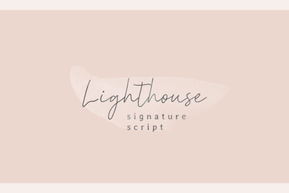
The letterforms have gentle contrast, subtle tapering, and just enough irregularity to feel authentically hand-drawn—no robotic uniformity here. Yet it avoids the “overly scribbled” trap some handwritten fonts fall into. That means it scales beautifully: crisp at 48px on desktop, still legible and charming at 32px on mobile, and even holds up as a decorative accent at 20px over image banners (with proper contrast fallbacks, of course).
Where It Shines—and Where to Step Back
Lighthouse is a display font at heart. It thrives in high-impact, low-density roles: hero headlines, section titles, call-to-action buttons (“Start Your Journey”, “Join the List”), logo text (when used sparingly), and short brand taglines. I used it for the “Welcome” header on a coaching site’s welcome board mockup—and paired it with a clean, airy sans serif for the supporting paragraph. The contrast created instant hierarchy and emotional resonance.
But let’s be practical: Lighthouse isn’t built for body copy, navigation menus, form labels, or dense dashboard interfaces. Its graceful joins and delicate terminals lose clarity below 16px, especially on lower-DPI screens or in tight UI components. I tried it for a small “Learn More” button on a mobile CTA—and while it looked lovely in Figma, real-device testing revealed slight blurring on older Android devices. Stick to sizes 24px and up for primary display use, and always test on actual hardware.
Also worth noting: avoid using it for accessibility-critical elements like error messages or required field indicators. Its decorative nature, while beautiful, reduces immediate scannability for screen readers and low-vision users. Reserve it for expressive, non-essential typography—and pair it thoughtfully with highly legible, WCAG-compliant fonts for all functional text.
Smart Pairing for Modern Web Layouts
Font pairing isn’t decoration—it’s design strategy. With Lighthouse, I consistently reached for neutral, open sans serifs: Inter, Poppins, and Manrope worked beautifully as body and interface fonts. Their geometric clarity grounds Lighthouse’s fluidity, creating visual rhythm without competition. For a more editorial feel—say, on a creative writing course site—I paired it with a light-weight serif like Cormorant Garamond, letting Lighthouse handle the voice (“Your Story Starts Here”) and the serif carry the substance.
What *didn’t* work? Another script font—even a simpler one. The textures clashed. And overly bold display fonts overwhelmed its quiet confidence. Lighthouse doesn’t shout; it leans in. So your pairing should do the heavy lifting elsewhere: structure, spacing, contrast, and clarity.
Real-World Technical Notes for Web Designers
Before dropping Lighthouse into production, I checked what’s included—and it matters. The package delivers clean WOFF2 files (excellent for performance), full Latin character support, standard punctuation, and basic OpenType features like ligatures and stylistic alternates. No swashes or excessive flourishes—just thoughtful, usable elegance. That makes it ideal for client sites, SaaS dashboards needing branded headers, or portfolio sites where speed and simplicity are priorities.
I verified commercial licensing covers web embedding, client projects, and template resale—critical if you’re building digital brand kits or selling website templates. No surprises there: it’s clearly labeled for commercial use, including SaaS and e-commerce platforms. Just double-check multilingual needs—if your site serves extended Latin or Cyrillic audiences, confirm coverage before launch.
Why It Feels Like a Design Upgrade—Not Just a New Font
There’s a difference between adding a font and elevating a brand’s digital presence. Lighthouse does the latter because it carries intention—not just style. On a product landing page, it softened the sales tone without sacrificing professionalism. In a blog header, it added warmth without undermining authority. Even in a minimalist portfolio, it gave the site a distinct voice without cluttering the layout.
It reminds me that great web typography isn’t about complexity—it’s about resonance. Lighthouse resonates because it feels like a person chose it, not an algorithm. It says, “We made this with care,” before a single word is read. And in a world of generic templates and AI-generated interfaces, that kind of authenticity isn’t just nice—it’s necessary.
If you’re refining a brand’s digital voice—or simply tired of fonts that look like they came from a stock template—Lighthouse is worth your time. Install it. Test it in your next hero section. See how it changes the air of the page. Then decide—not based on trends, but on how it makes your audience feel seen.